Problem
Design in Vivy needs to have scalability, efficiency, and consistency, because the teams were growing very fast and features needed to be delivered quickly and with quality.
After Vivy hired its third UI/UX designer, with each designer handling a delivery team, the need for scale, efficiency, and consistency in Design was very apparent.
Business Goal
Reduce the amount of time needed to create UI designs and develop features | Increase speed of delivery, saves money
Solution
A Design System
The primary solution was to come up with a design system that was guided by principles and best practices. Also, to keep with documented at each step to ensure consistency and efficiency of work.
UI Components Library in developer’s project
Our ambitious goal to speed up development phase required that the developers see the benefit of the design system and utilize it.
Impact
80% decrease in onboarding time for new designers, thanks to the descriptive design library in sketch and abstract
80% decrease in engineering time, according to front-end developers, thanks to componentization in code
* Estimated by front-end developers and designers
Overview
As the Vivy team grew, it became increasingly important to maintain a consistent style and visual language across all areas of the product. With nearly a dozen products features, it was clear that we needed more systematic ways to guide and leverage our collective efforts.
The outcome was a collection of reusable components, guided by clear principles, that can be combined together to create as simple, consistent, and smooth experiences, as possible.
Tasks & Duration
Project Management, Research, Visual Design & Illustrations
Team of 3 designers & 20+ developers
Discovery
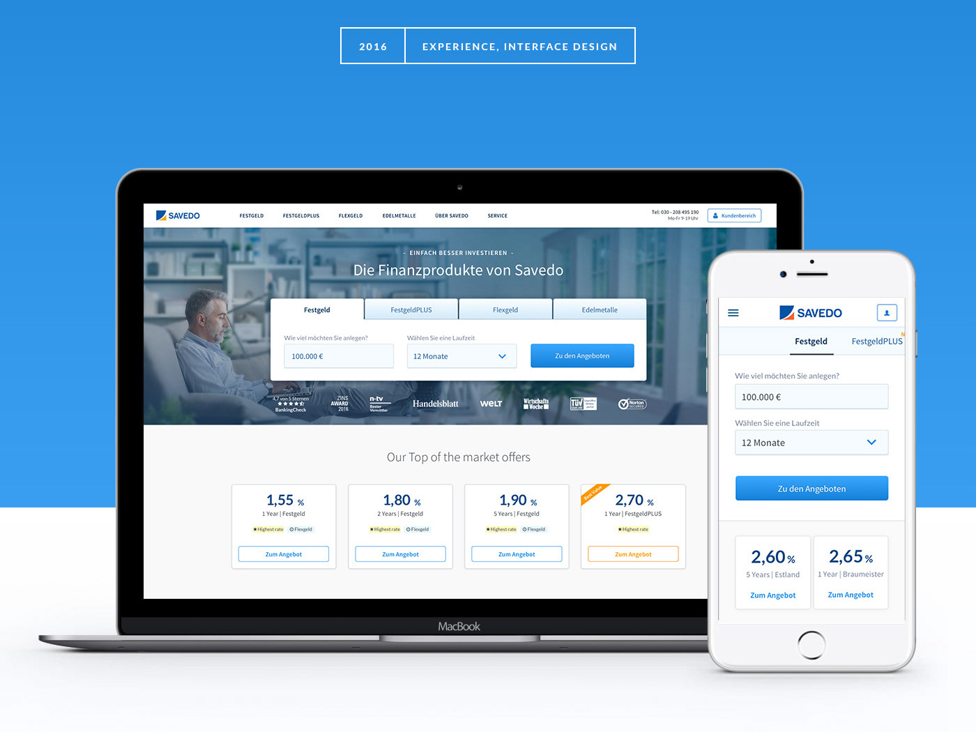
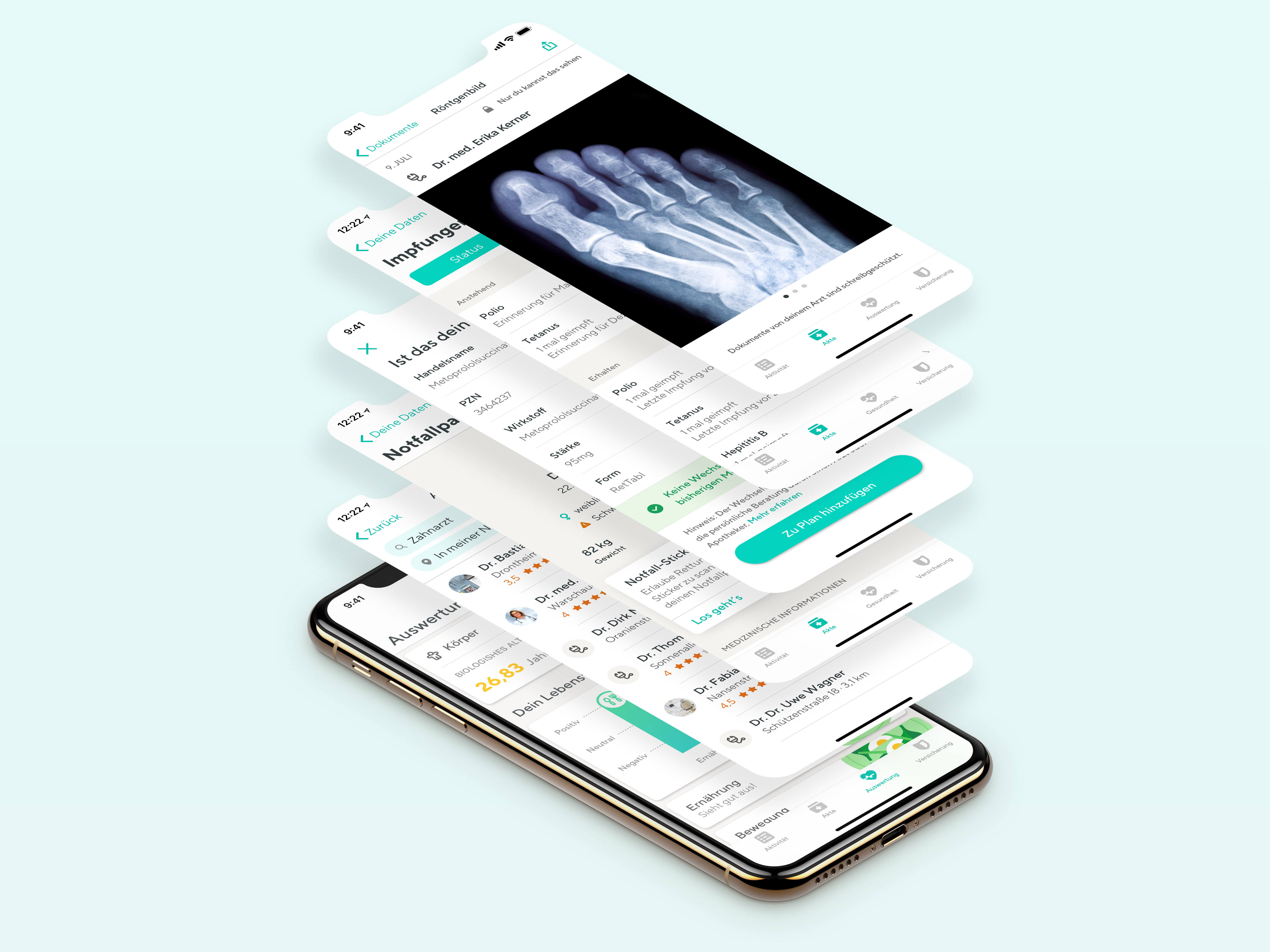
The first step of solving any problem is collecting data. I, together with the two other designers, started to take screenshots of design patterns, to form an inventory of all different versions of patterns. We decided to start with our iOS app first.
Next, the design team started to cluster screenshots together to form patterns. At times, we were ripping screenshots apart. The patterns were clustered based on different criteria, e.g functional screen types, layout templates, UI components.

>25 patterns emerged
After the preliminary inventory, we also found out that there were also a lot of inconsistencies in colors and typography used across the product. So we performed an inventorization for them as well.
The inventorization of colors at Vivy showed a massive redundancy slowing down the development process. In Sketch, more than 40 colors variables with 12 shades of gray were used.
Our designers suffered while working on the design files because of the amount of unnecessary text styles imported from iOS and Android’s guidelines. Due to lack of typographic pairing rules, our product also suffered from inconsistent design. Additionally Vivy were receiving complaints from users regarding typography. The text wasn’t very readable due to low contrast. Users didn’t know they could tap/click on some elements.
Laying the Foundation
This system is based largely on the principles of Atomic Design. This foundation loosely defined our typography, colors, icons, spacing, navigation and information architecture.
"Interfaces are made up of smaller components. This means we can break entire interfaces down into fundamental building blocks and work up from there. That’s the basic gist of atomic design."
Atomic Design — Brad Frost

Iterations
Throughout the 1,5 years that I've been working on this design system, the design team had to rebuild it three times. With each time, we learn and add another thing to our conventions.
The reason for rebuilding the design system each time varies, but the main theme remains the same. The Sketch file structures and how the Sketch symbols, text styles, and layer styles were named, were not enabling designers to work the most efficiently.
Finally, we've figured out a naming convention that works with all the different ways a designer would use the design library 🎉.
Conventions
After our third time of rebuilding the design system, we learned to put all of these components into a master Sketch library file. We call it Cross-platform Assets. We use Abtract to link this master library file to the different platform-specific projects.

From our previous lessons, in order to optimize onboarding process for new designers, we've created an intro page on every project's library file. This page contains all of our naming conventions and instructions on how to utilize the library. The naming conventions includes pages, artboards, symbols, nested symbols, layers, and groups.
While the library was growing, we organized components into categories based on the principles of Atomic Design. For example on iOS, the categories are Bars, Controls, Layouts, Cells, Modals, and System.
Later we planned on creating a public website to document the system that can be used by both devs and designers, as well as a free UI Kit.

Grid
We use the 4pt grid system to space out the elements on a page. This means that any defined height or weight, margin or padding will be an increment of 4.
Colors
We are committed to being compliant with AA standard contrast ratio.

Typeface
We exclusively use TT Norms as the base typeface across the entire Vivy product.

The Hard Part — Getting What You Designed to be Implemented
One of the biggest challenges that I've come across in this project is persuading the devs to implement the design system in their code.
I had to explain to my developer colleagues how putting extra effort into building something once and later being able to reuse will benefit them.
We first started small -> Showed them the benefit due to them being able to code faster -> Scale.
Nowadays, at Vivy, we're proud to have UI component libraries on all of our platforms (Android, iOS, and Web). The devs' UI component libraries are the equivalent of the designer's symbol library and work similarly. Also, together with devs, we've created demo apps on Android and iOS, for the UI components.

Learnings & Challenges
Planning & Priority
We constantly toggle between working on our Design System and enhancing the application. Planning and prioritizing our tasks is vital.
Getting the rest of the company onboard
Once the Design System was somewhat defined, we needed to prove to the rest of the product team and the Dev. team that spending time building UI components will increase the speed of development and, therefore, benefit the whole organization.
Rebuilding something new is sometimes better than fixing something old
Our product designers had to collectively agree and decide to rebuild our design system in Sketch/Zeplin three times. Each time with better naming conventions, structure of files, artboards, symbols, and layers.