Context
Our patients use the Patient App to get reminded when they should change their dental aligners and to share their progress with real dentists.
The Problems
- We observed the photo rejection rate in Metabase which became regrettably worrying.
- Pictures they were submitting were rejected because they were either blurry or not taken at the right angle therefore the dentist checking them could not give an educated opinion if the patient should proceed further.
- People were calling in to ask what they shall do regarding when they should exchange the aligner because they missed the deadline.
- There is no direct discussion line from dentist to patient. Therefore the dentist's answer takes days.
- This delay means they cannot change to their next aligner set, which in turn delays the treatment duration.
Our Assumptions
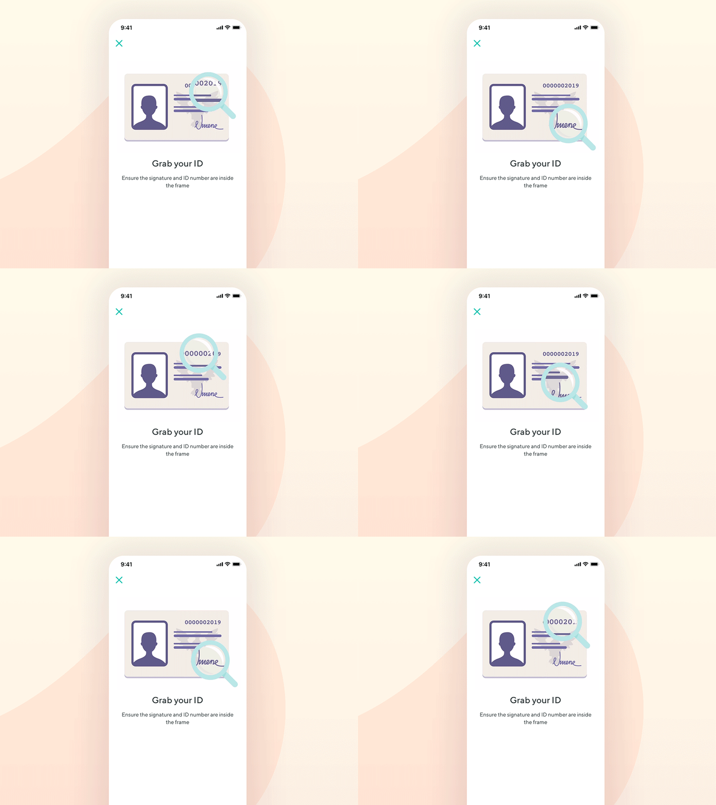
The information on how to take photos of your teeth is in the brochure that people receive together with the dental aligner package, so we believe that people forget or do not realize this.
Trying to validate the Problem
We collected some of the emails of the people affected. We sent out a small survey to them asking the questions:
1. "Are you aware of any instructions on how to correctly follow the treatment plan, especially the photo-upload feature?".
- 84% answered with "No".
2. "Please choose an answer that best describes the experience of uploading photos of your teeth"
- 32% answered with "Frustrating".
Ideating
How might we provide patients with an easier experience to take and upload pictures of their teeth?
- We agreed the app should have a feature that allows patients to take and upload photos in sequential order instead of taking them with the native camera app and then having to switch back to the Patient App.
How might we help people not overlook the instructions on how to take said photos?
- We quickly agreed that the most obvious place where instructions should not get overlooked is inside the app.
How might we enable patients to tell us their experience after each aligner change?
- We agreed to offer them a free text area at the end of the flow so they can easily send us a message. Also eventually we agreed to allow them to rate their satisfaction level for every aligner change. Design 1st Sprint
Trying to pinpoint the biggest reasons for rejection
Design 2nd Sprint
Measuring Success
- Satisfaction level bar would give us an overview of which patients are experiencing issues so that we can proactively contact them.
- The text area allows us to gather continuous feedback for patients. This reduces the strain on Customer Service by allowing patients to just simply send us a message that would be directly sent out to dental technicians and dentists.
Long-term rejection rate
The rejection rate has dropped from its peak, which was 55% to 21%.


