The following shots are some of the illustrations, animations, interfaces, and micro-interactions that I have made throughout the years at the various companies I have worked for. I hope you enjoy them :)
Issuu illustrated icons
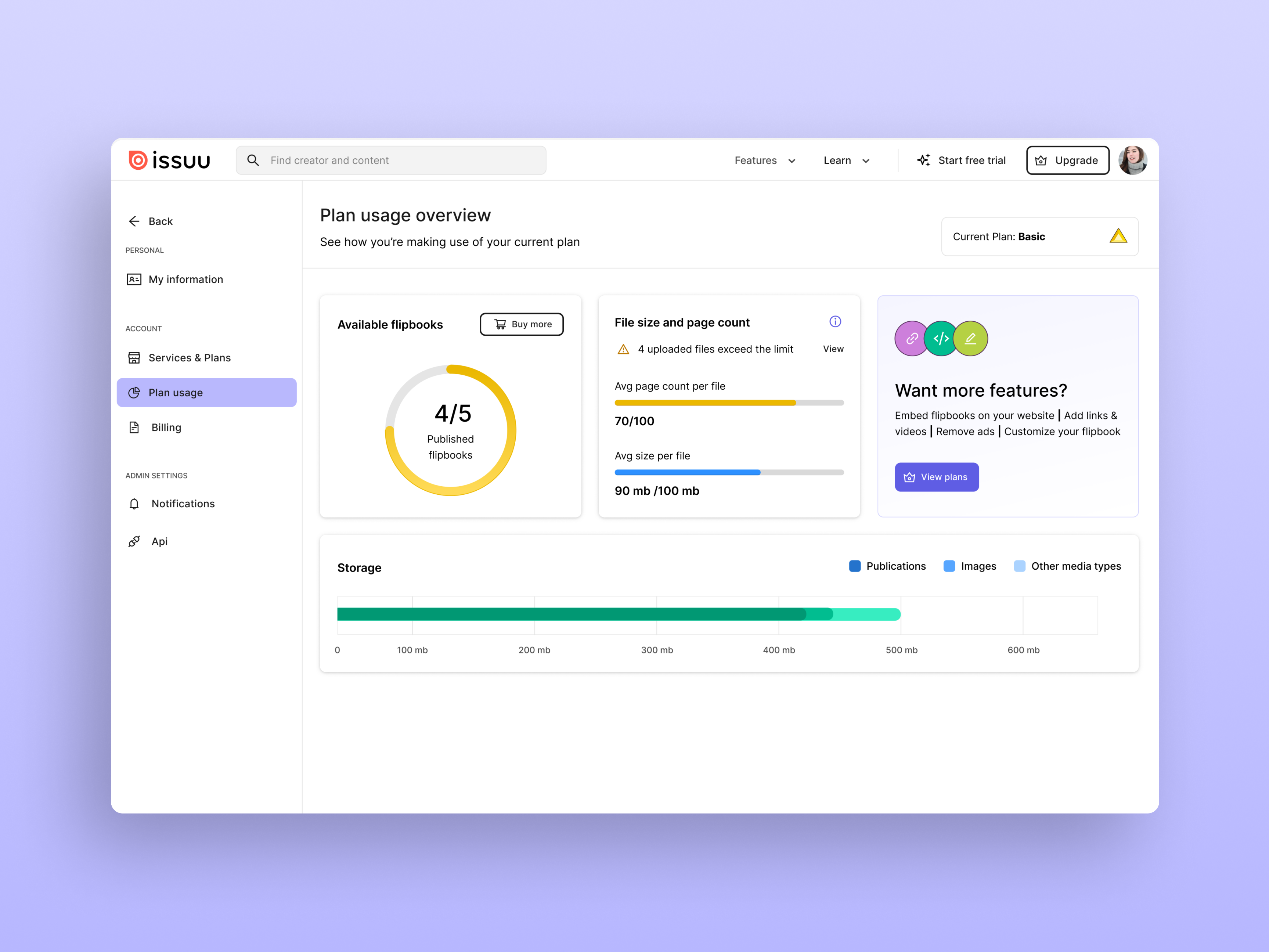
Issuu's explanation dialogs
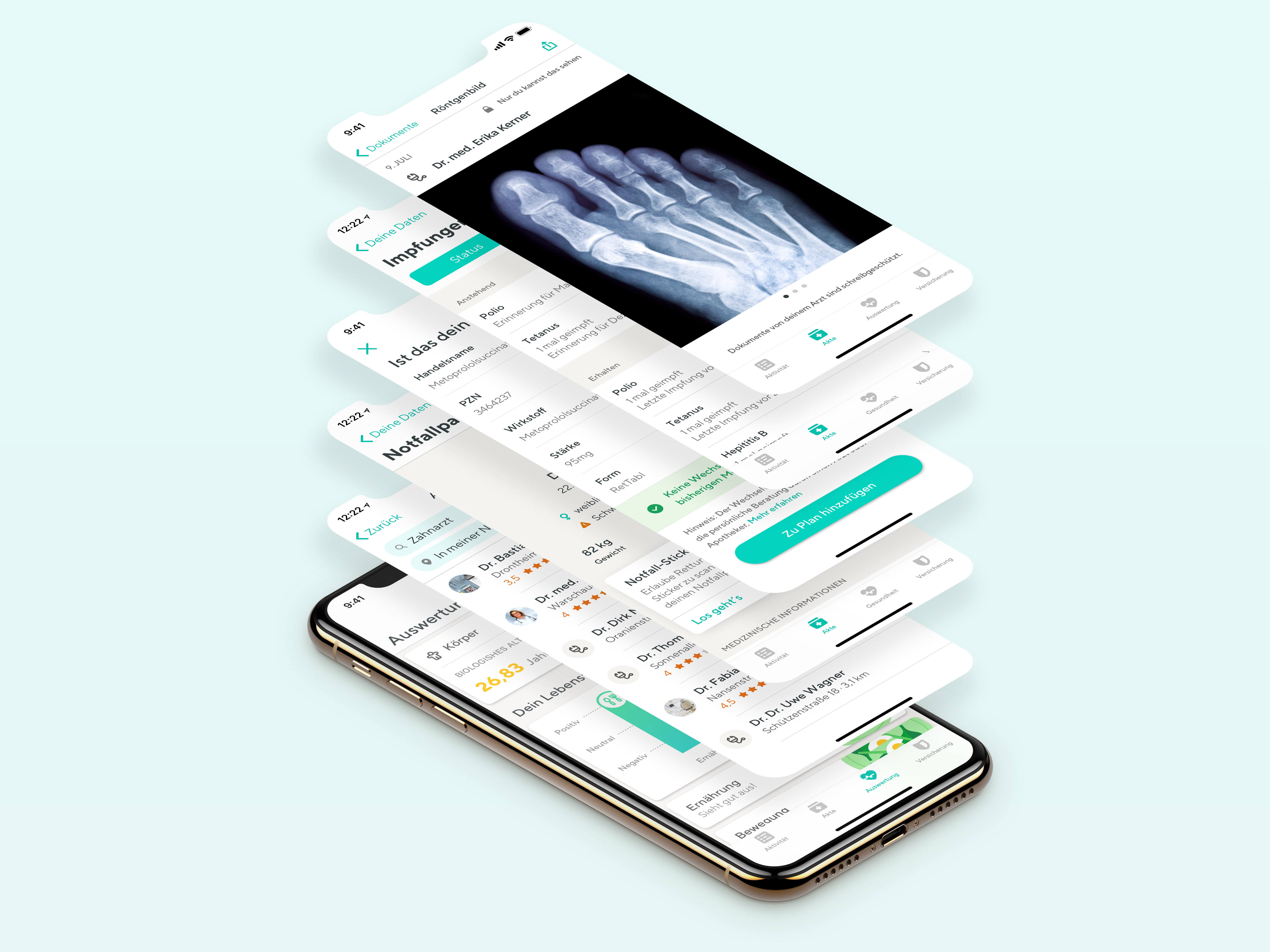
Vivy dashboard concepts
Reduce a signup flow time
Problem
The current signup flow for the Vivy app takes approx. 6 minutes and users find it tedious.
Solution
Take out some steps from the signup and prompt the users to take action towards them as soon as they get inside the app. This way they can quickly get in and explore the app and finish their 100% profile completion at a later point, more convenient for them.
Using motion for better highlight
Problem
During the KYC process, users were taking shots of their ID without caring if the signature and number were visible.
Solution and Outcome
Added one screen before with an animation highlighting to the users the areas that need to be visible. The illustration together with the animation made a huge difference and the process dropped its error rate by 33%
404 Page
Problem
Upon experiencing a technical difficulty, users were lacking a universal message and proper instructions on what to do next. In other words, a 404 page.
Data Visualization for FinTech Products.


